Projects
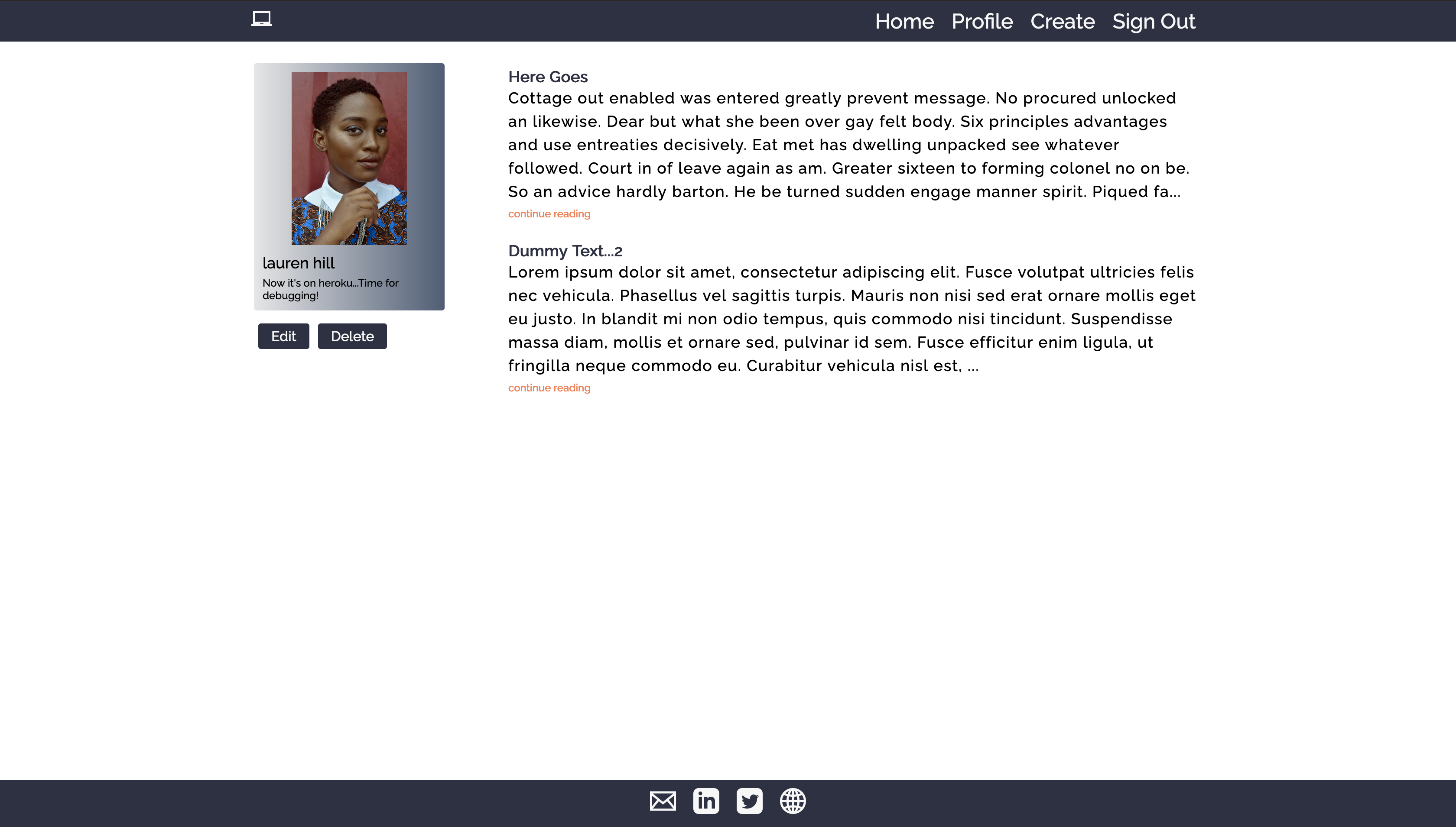
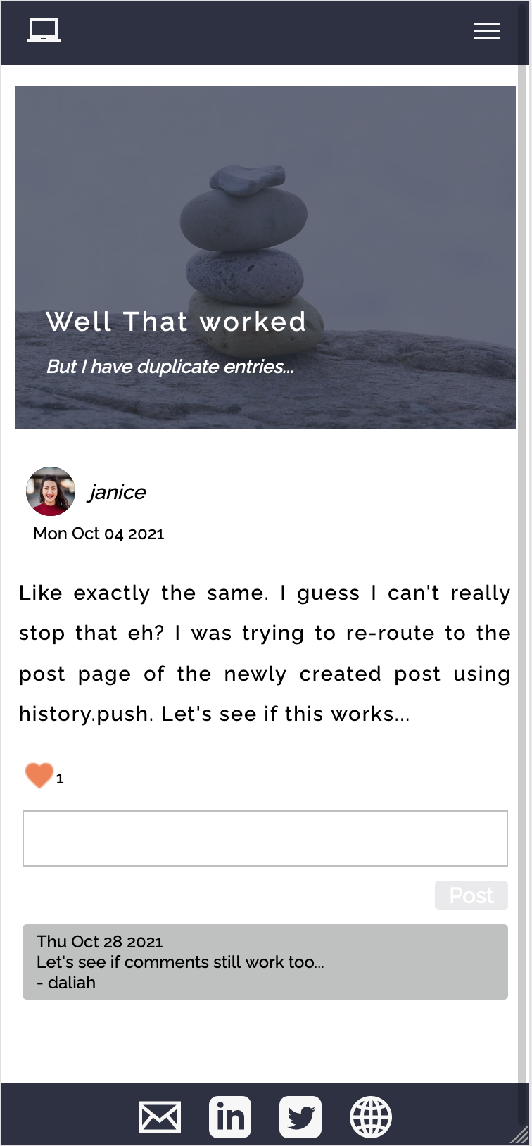
Blog web application built with React, React-Router, NodeJS/Express and MongoDB. This is my first full-stack application!
I went with a mobile first design approach and achieved responsiveness with a combination of conditional rendering and media queries.
I wrote the backend API with the intention of fully rendering the application on client side. I utilize custom error handling and follow the JSend specification for serving responses.
I also use JSON Web Tokens and HTTP only cookies for security to maintain a fully stateless application
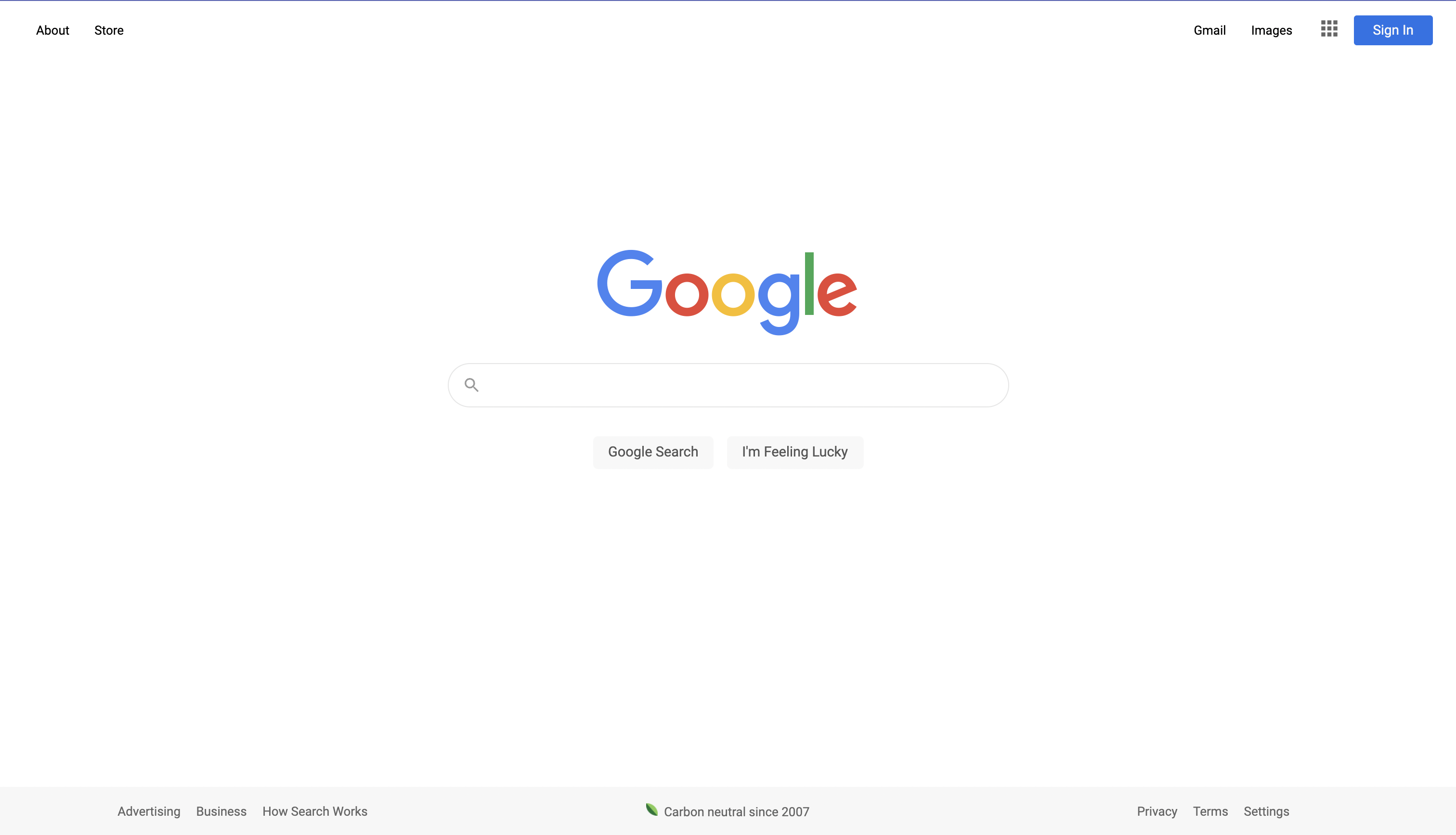
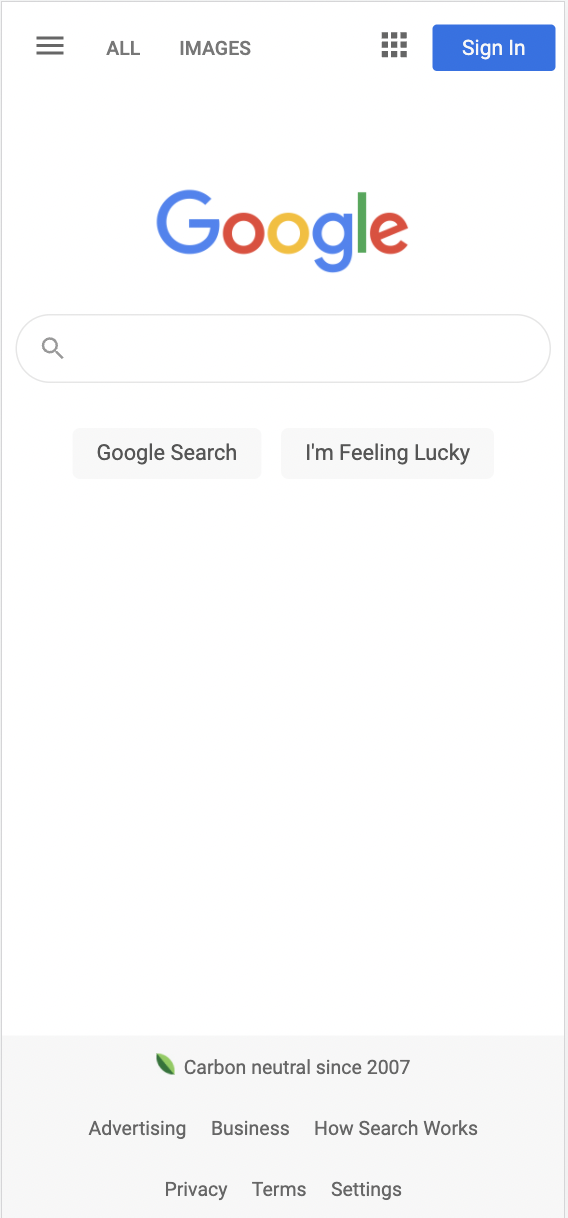
Google homepage, fully responsive on most devices, built with HTML and CSS. This is an assignment that's part of The Odin Project's foundations curriculum.
It's 'mostly' responsive at the moment as at the time I wrote it, the smallest testable size in the Chrome developer tools was 375px. Little did I know the Samsung fold has a width as little as 280px!
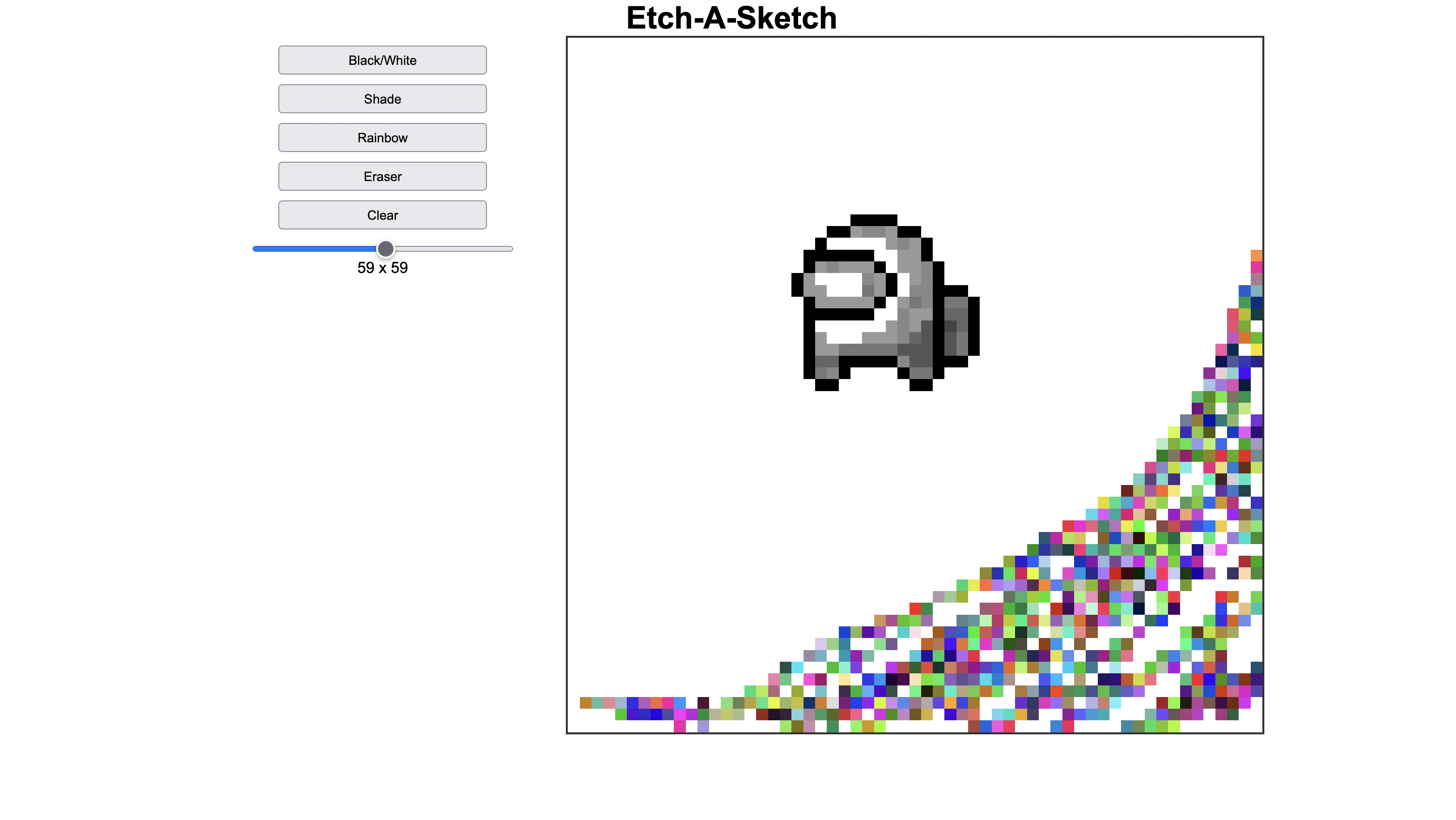
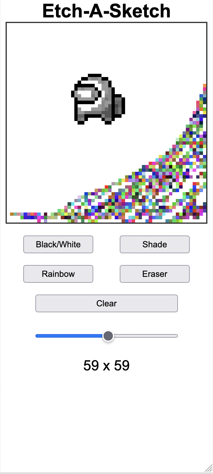
Etch-a-Sketch, fully responsive on most devices, built with HTML, CSS and Javascript. This is an assignment that's part of The Odin Project's foundations curriculum.
This project was a delightful exercise in responsive design, and DOM manipulation. I even picked up a little CSS trick where, in order to maintain a perfect responsive square, one designs a container with a specific width, no height, and sets the bottom-padding to 100%. The padding being proportionate to the width will constantly expand/shrink with the width to achieve this effect.
I gave the container a position of relative and placed another container of the same size within with a position of absolute. In this container, using the flex display, I drew my grid.
To achieve the draw effect I used the mouseover event listener on the drawing board itself rather than a mouseenter event on each individual cell, which, I imagine would be more taxing.